John Lincoln

14 Hacks To Get More Conversions From Your Form

If you’re not following form design best practices, you’re limiting your conversion rate. That means you’re losing money. 

In this article, we’ll go over some form design tips that maximize conversions.

for design tips to maximize conversion

Fortunately, with a little bit of know-how and a great development team at your side you can put together a form that keeps the cash register ringing.
  1. Trim the Fat

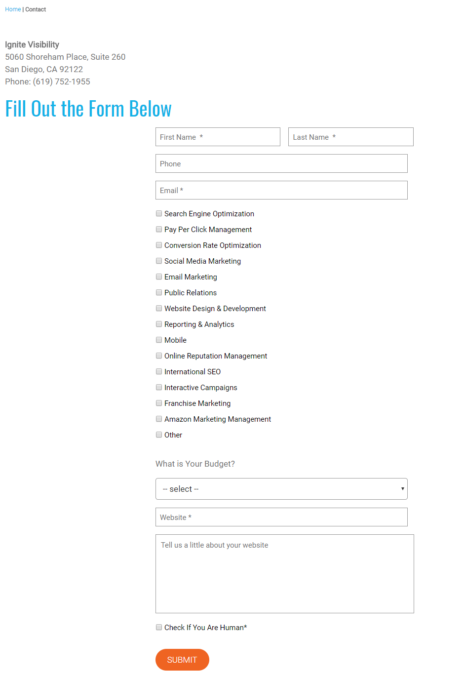
The first thing to do with your form is to trim the fat. In other words, ask for only the absolute minimum of information you need and nothing more. Too many forms try to extract an excessive amount of data from customers. That might seem like a good idea for market research purposes, but it’s a bad idea for conversion optimization. People tend to bail on a form if it asks for too much info. That’s why you should limit your inputs to only what is required to take your users to the next step. For example, if your form is getting information for an email list, you only need the email address and possibly the person’s first name. You don’t need a home and mobile telephone number, snail mail address, and marital status. Keep in mind also that you’ll increase your conversions with mobile users if you keep your form short. They won’t want to fill out a whole lot of fields with a smartphone’s virtual keypad. If you really do want to amass a whole bunch of data about your users so you can do market research, consider doing it piecemeal. Ask for that additional detail once you’ve snagged the initial conversion. For example, this is the form I have on Ignite Visibility right now. I could easily simplify this form and get more conversions. I don’t, because we want to overly qualify the customer and we are currently getting many leads.
  1. Use Conditional Logic to Shorten Your Form

Unfortunately, not all forms can be as simple as a single email field. Sometimes, you’re going to need more info. However, you might need that additional info only for a certain subset of users. For example, if somebody is registering for a free trial for your online service, you might just need an email address. On the other hand, if that person is registering for full access, you’re going to need payment details. There’s no reason you can’t have the same form handle both users. Just use conditional logic to expand the form if the user selects the option for full access. Otherwise, just display the field for the email address.
  1. Use a Single Column Format

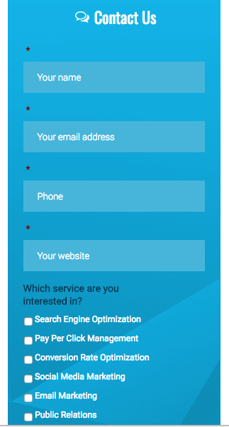
The web has changed a lot over the years, but it’s never departed from its first love: vertical design. Since the earliest days of Netscape to the modern era of souped-up browsers, web surfers have become accustomed to scrolling vertically when viewing content online. Your form design should follow that pattern. That’s why it’s a great idea to use a single-column layout in your forms. It will give users a familiar feel as they move from field to field by scrolling down. Also: a vertical presentation is best suited to the skinny viewport of a smartphone. Although smartphone users can turn their device horizontally for a wider screen, they tend to hold it vertically.
ignite opt-in form
Use a single-column layout in your forms
Simply put: there typically isn’t enough room for form fields stacked side-by-side on a smartphone screen in portrait mode. Stick with a vertical presentation. It’s adaptable to any platform and it favors the natural presentation of web content. Even better: there’s some science to demonstrate that users complete single-column forms faster. That’s sure to help your conversion rate.
  1. Use Inline Form Field Validation

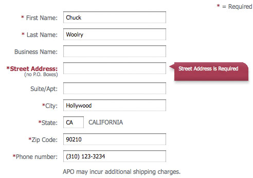
If you do require users to complete multiple fields, then form field validation is a must. One of the best ways to handle that is with inline validation. What’s inline validation? It’s a way to alert the user about form field errors in real time. For example, let’s say one of the fields in your form requires an email address. In that field, the user enters “joegmail.com”. Note that the user left out the “@” sign. The email address is invalid. If your form is using inline validation, then Joe will see an error when he tabs to the next field. Even better, that error will appear just below the field where he entered the email address.
inline error screen
Inline validation is a way to alert the user about form field errors in real time
In that case, he can simply go back to the email address field and add the missing “@” sign. He fixes the problem before he even submits the form. Inline validation is a great way to give users on-the-fly feedback about the fields they fill out. It’s also a way to eliminate some of the frustration that people feel when they submit a form only to find out that certain fields are invalid. Keep in mind, though, that you can go too far with inline validation. That will frustrate users as well. For example, if you display an error message before the user has even finished typing, you’re giving a premature alert. Instead, wait for the user to tab to the next field before attempting any validation. Some form designers also use positive reinforcement with inline validation as a “reward” system. The UI instantly displays a green checkmark next to a field if it passes validation. Once again, science backs up the value of inline validation. According to research carried out by Google Product Director Luke Wroblewski, inline validation offers the following benefits:
  • 22% decrease in field errors
  • 31% increase in satisfaction rates
  • 42% decrease in completion times
While this is true, in my own experience you are going to have issues if you make the form too touchy. Meaning, don’t have validation on www and non www if you ask for their website, upper case and lower case, things like that.
  1. Start With the Easy Stuff

When it comes to form design, it’s best to put the fields at the top that are the easiest to fill out. Ask for the more challenging stuff towards the bottom. Why? Because you don’t want to scare people away right out of the gate. If you need to ask people for a name, address, and credit card number, start with the name. Then, ask for the address.
start simple with forms
Start forms easy. Ask for their name first
Finally, get the credit card number. More likely than not, your users won’t have that number memorized and they’re going to have to get up and go find their wallet or purse. You don’t want to lead with forcing people to move around for information. Make it the last step. Yes, there’s science behind this design trick as well. Robert Cialdini’s principle of commitment (from his great book Influence: The Psychology of Persuasion) informs us that once people start moving towards something, they like to keep moving in that direction. Get your users moving towards conversion by asking for the easy info first. Then, they’ll be more likely to follow through when they get to the more challenging fields.
  1. Use Auto-Format

Some fields might require certain formatting. Use the wonders of modern technology to handle that formatting instead of making the user do it. For example, let’s say you need to collect a phone number. You want parentheses around the area code and a dash between the first three digits of the actual phone number and the last four digits. In that case, add that formatting automagically. Don’t make the user type the parentheses and the dash. Fortunately, modern web form design techniques make it exceptionally easy for you to add whatever formatting you want as the user is typing. You’ve probably seen that yourself when you’ve filled out forms that required phone numbers, Social Security numbers, and zip codes with a 4-digit suffix.
  1. Tell Users Which Fields Are Required

Another way that you can make your form user-friendly is by letting people know up-front which fields are required. That’s usually accomplished with an asterisk next the field label. You can also use color-coding and inline warnings if users skip over the field. For example, let’s say your form requires a mailing address. In that case you might show supplemental fields, such as a second and third line for the street address. However, it should be clear that those fields are not required if the user can fit everything into a single street address field. Any other “nice to have” fields should also be clearly identified as such. That way, users can fill out the form faster.
  1. Use Radio Buttons Instead of Drop-Downs

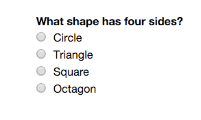
One reason that people abandon forms is because they get frustrated with drop-down elements. Yes, there’s evidence that you can lose conversions with drop-down fields. If you want users to make a selection from a variety of multiple options, use a radio button instead of a drop-down. Why? It’s easier to read and it doesn’t interrupt the user experience flow by insisting on a touch or click to see all available options. Keep in mind, you can also add a checkbox element instead of a radio button element to allow users to select multiple options.
radio buttons
Radio buttons are easier to use than drop-downs
  1. Be Discreet With Your Coupon Code Field

What’s the last thing you want people to do when you’ve got them filling out your form? Answer: leave the form prematurely. That’s why you shouldn’t make it obvious that there’s a coupon code to be found somewhere. Otherwise, people will leave the form to go search for the coupon code. In many cases, those people never return. Take that temptation away from them by making your coupon code field discreet. For example, you could just present a text link that reads: “Have a coupon code?” If they click that link, they’ll see the field. You could also put the field towards the bottom, hidden in plain sight so that it’s not too obvious.
  1. Use Field Focus

Another great way to make your form user-friendly is by adding field focus. What’s field focus? It’s a means of highlighting the field that the user is currently filling out. That’s important for people filling out your form on a mobile platform. Those folks have a little more trouble “seeing” where they’re at than people on a desktop or laptop. One of the best ways to highlight a field is by changing the color of the text and the lines around the input box. Just be sure to use a color that contrasts with unhighlighted field elements and stands out against the background.
  1. Let People Know Where They Are

As we’ve seen, it’s a great idea to keep your forms simple with a limited number of fields. However, sometimes that’s not possible. For more complex transactions, you might need to gather a lot of information. If you need a multi-page form, make sure that you let users know where they are in the form completion process. For example, if the user has to fill out a form with 4 pages, make sure that you prominently display the page number at the top and bottom of each page. Why is that important? Because it sets expectations. It lets users know that they won’t be filling out fields all day long. That comfort level will likely boost your conversion rate.
  1. Use Placeholders

One great way to make your form user-friendly is with placeholders. You’ve probably seen placeholders before. They’re “hints” about the kind of info that’s required in a form field. For example, in a zip code field, you might add a placeholder that reads: “For example, 90210.” That text will disappear the moment the user starts typing in the field. Placeholders are an outstanding way to virtually hold a user’s hand as he or she progresses through the form. They leave little doubt about the kind of info you’re looking for. Some people argue against this, but based on tests I have seen there is often an improvement. Especially in the case of credit card information where you need to know the number of digits or a validation code.
  1. Ditch the Captcha

Some web designers, in an effort to thwart bots, add captchas to their forms. You’re probably familiar with captchas even if you don’t know them by name. They’re the widgets you see on some forms that present a couple of words in image format, often with certain letters stretched out. They ask the user to type the words into a field before submitting the form. First of all, they don’t do that good of a job at thwarting bots because captcha-busting technology exists. Second, they’re guaranteed to irritate your users. Think about it: how many times have you seen a captcha word that you couldn’t even read yourself? Then, when you take a guess at it, you’re informed that you guessed wrong. Do you want to put your users through that? Of course not. Keep captchas off your form. Let the bots have their way if it means improving your conversion rate. I often recommend a simple checkbox instead that says, “Check if you are human.”
  1. Make the Chat Button Stand Out

If you’ve got the resources for it, you probably offer users the chance to chat live with one of your support reps while filling out the form. That’s important because it gives the user a chance to have questions answered during the form completion process. Sometimes, getting those questions answered is all that’s necessary to landing that new customer.
chat button
Make sure the chat button stands out
The design tip here is that you want the chat button to stand out so it’s easy for users to find. Otherwise, they might not even know that you offer live support. Design your chat button with colors that contrast not only with the background, but also with the text on the form. Make it unusually large so it stands out.

Get Your Form Converting Better Now

I recommend you go to your exit page report in Google Analytics and see how many people are leaving your form. If it is over 20%, get to work on fixing these items. How are your forms converting for you?

Leave a Reply

Your email address will not be published. Required fields are marked *

Welcome To John Lincoln Marketing

Welcome to John Lincoln’s personal website. You can learn about John Lincoln’s books, films, book him to speak and contact him. John is directly associated with many of the businesses mentioned on this website and freely discloses this information. 

About the Author

John Lincoln is CEO of Ignite Visibility, one of the top digital marketing agencies in the nation. Ignite Visibility is a 6x  Inc. 5,000 company. Ignite Visibility offers a unique digital marketing program tied directly to ROI with a focus on using SEO, social media, paid media, CRO, email and PR to achieve results. Outside of Ignite Visibility, Lincoln is a frequent speaker and author of the books Advolution, Digital Influencer and The Forecaster Method. Lincoln is consistently named one of the top digital marketers in the industry and was the recipient of the coveted Search Engine Land “Search Marketer of The Year” award. Lincoln has taught digital marketing and Web Analytics at the University of California San Diego since 2010, has been named as one of San Diego’s most admired CEO’s and a top business leader under 40. Lincoln has also made “SEO: The Movie” and “Social Media Marketing: The Movie.” His business mission is to help others through digital marketing.

Contact John Lincoln

Want to get in touch with John Lincoln? Click Here To Reach Out.

Related Posts